The Trading Bible Trading Guides ᑕ❶ᑐ Understanding Stock Candlesticks: Patterns, Charts, Meaning
Stock Candlestick 101 - Understanding Basic Candlestick Charts
By Stelian Olar, Updated on: Jul 12 2024.
Think stock candlestick charts are just for old-school traders?
Think again.
Candlesticks have been around since 18th-century Japanese rice merchants used them and were introduced to modern technical analysis by Steve Nison in the 1980s in the book “Japanese Candlestick Charting Techniques” – one of the best book to understand candlestick.
Today, these distinctive charts are a staple of stock trading. From day traders to long-term investors, market players use stock candlestick patterns to identify potential price changes and assess stock price performance.
In this article, we'll unpack how to read a candle chart stocks so you can make the most of these centuries-old patterns. Here's what we'll cover:
- The candlestick stock meaning
- How to read candles on a stock chart
- Candlestick components
- What to look for in charts
- Basic candlestick patterns
- Different types of patterns
- Whether trading on patterns pays off
Ready to become a stock candlestick chart pro?
Let's get to it.
Stock Candlestick Meaning
Candlestick stock charts depict price action in a visually appealing way by tracking the movements of securities better than old-school bar charts or line chart.
And the price action is easier to interpret at a glance, which is why you need to get a grasp of stock candlestick meaning.
 Candlestick chart vs Line chart
The name comes from their resemblance to actual candles. Each candlestick has a "body" (the thick part) with a "wick" (the thin line) on top and bottom. It's like a vertical candle burning at both ends.
Each candle normally represents one day's price action for a given stock or security but the timeframe can also be adjusted based on preference. Over time, the candlesticks form patterns that traders can use to inform buying and selling decisions.
So in one glance, candlesticks neatly package opening and closing prices alongside intraday price range - valuable insight into stock market psychology.
How to Read a Candle Chart (for Dummies)
Now you’re probably wondering:
“How to read a candle chart?”
To read a stock candle chart, you need to understand what each candle tells you. Each stock market candle chart packages 4 key data points open, high, low, and close prices for the time period selected:
- The opening price - This is the very first trade at the start of the period.
- The closing price - The last trade before the time period ends.
- The high - The highest price reached during that timeframe.
- The low - The lowest traded price for that period.
 Stock candlestick
Candlestick Components
Candlesticks have three main parts that each give insight into the stock’s price action:
- Upper shadow
- Real body
- Lower shadow
Upper Shadow
The upper wick or shadow shows the highest price reached during the period. A longer upper wick signals prices climbed much higher than the open price while a short upper wick means the stock price stayed nearer the closing price.
Real Body
The real body is the thick rectangle in the middle reflecting the open and close prices.
Was the body of the candlestick stock chart, green or red?
That tells us whether bulls or bears won the fight.
Hollow green candles happen when bulls are in charge - price closes higher than it opened. Filled-in red candles occur when bears take control - price closes lower than it opened.
Lower Shadow
The lower wick or shadow marks the lowest traded price for the period. A long lower wick indicates prices dropped far below the opening price and closing price. A short lower wick suggests support held close to the open or close.
 How to read a candle chart
The body of the candle shows the open and close price for the time period. If the body is filled in (or red), that means the close was lower than the open (bearish). An empty body (or green) indicates the close was higher than the open (bullish). The wicks visualize the intraday high and low prices.
If you want to learn how to read and understand candlestick charts make sure you familiarize yourself with these stock candlestick charts concepts.
What Should I Look for in a Candlestick Chart
Let's analyze the SPY stock candlestick chart below together to understand what to pay attention to.
 Spy stock candlestick
On Monday, we see a red candle with a short body and long upper/lower wicks. This means bears were in control with a close above the open, but the range between open and close was small. There was volatility though as prices stretched up and down compared to the open/close levels.
On Tuesday, there is a tall red candle with very short wicks. The bears dominated with the close far below the open. The tight range of the wicks signals limited volatility as prices consolidate around the open and close.
The contrast shows Monday had a mixed tug-of-war while Tuesday saw bears firmly in command. The radically different candle shapes tell the story visually.
How to Understand Candlestick Chart
In general look for:
- Color - Green (bullish) or red (bearish) candles
- Body size - Wide range between open/close means a larger price move
- Wick size - Long wicks indicate high volatility and swinging prices
Analyze how the daily candles relate to each other to spot trends and shifts in momentum.
The stock chart candlestick patterns will jump out at you with time.
The relationship between the shadows and the body reveals how bullish or bearish the market was for that period. Large shadows indicate high volatility and emotion while small shadows reflect consolidation around the open and close prices.
Stock Candlestick Patterns - Understanding the Basic
Candlestick charts tell short visual stories about the emotional tug-of-war between bulls and bears, buyers and sellers, and ultimately fear and greed.
But don't forget - context is everything in understanding candlesticks!
It's easy for beginners to get excited spotting a hammer or hanging man but a single candle doesn't reveal much on its own. You have to look at the preceding price action and what comes after.
Think of it as reading a novel - you can't grasp the full meaning from a single sentence. Each candle provides one line in the larger plot.
For example, a hammer pattern after a downtrend signals potential capitulation and trend reversal, but on a flat, sideways candle chart stock, that same hammer provides little insight.
 How to read a candle chart for dummies
The market will try to fake you out with false signals when you ignore stock candlesticks context. That's why other technical indicators should confirm candlestick patterns stocks.
Candlestick charts capture emotion well through coloring. But they are still just one chapter in the whole price action story. Learn how to read a candle stick chart, and you'll better spot future price movement.
Types of Stock Candlestick Patterns
There are tons of stock market candlestick patterns to look for on the charts. Some are more reliable and tend to play out as expected more often. Others are less dependable.
Candlestick patterns come in bullish and bearish varieties:
- Bullish patterns signal potential uptrends ahead and emerge by upward price movements.
- Bearish patterns indicate possible downtrends developing. These emerge from downward price action.
While price movements may seem random day-to-day, they form identifiable shapes and trends over time. Of course, no single pattern works 100% flawlessly. But combining candlestick analysis with other indicators can improve your odds and your own candlestick understanding.
Let's overview a few of the most common and straightforward candlestick stocks formations to get started...
Bullish Engulfing Pattern
Bullish engulfing pattern or bearish engulfing patterns where the second candle's body totally engulfs the previous day candle.
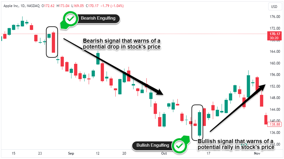 Bullish engulfing pattern
Morning Star
The Morning Star is a bullish three-candle reversal pattern signaling the end of a downtrend:
- The first is a long red candle that shows strong selling pressure.
- Next, a small-bodied candle gaps down below the first candlestick.
- Finally, a long green candle closes firmly into the first candle's body.
 Morning Star
Hanging Man
The Hanging Man is a bearish reversal pattern that emerges after an uptrend and signals a potential exhaustion of buying power. This candle has a small real body and a long lower wick. The long lower wick shows sellers pushed the price substantially lower intraday. But by the close, buyers return and pushes the price back up while the selling pressure fades.
 Hanging Man pattern
Three White Soldiers
The three white soldiers pattern consists of three consecutive long white candles (bullish candlesticks), that have each open and closing prices progressively higher. This shows strong, sustained buying pressure steadily pushing the price up from open high.
The pattern signals growing bullish control and potential for an upside reversal after a sell-off or bearish price action.
 Three White Soldiers
Three Black Crows
On a candlestick chart, the three black crows pattern is the inverse of the three white soldiers pattern. This bearish pattern forms after an uptrend.
You'll see three long red candles in a row, each opening around the prior close price but relentless selling pressure pushes the price lower by the close each day.
With no wicks, it shows a steady capitulation - the bears are in control.
Each lower open and close confirms their domination.
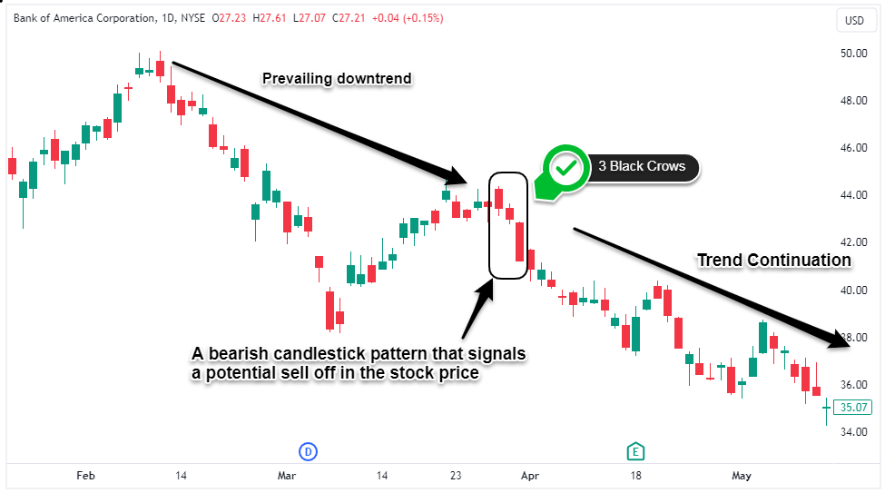 Three Black Crows
Is Trading Based on Candlestick Patterns a Good Idea?
Trading based on stock candlestick pattern only works if you learn first how to understand candlestick. They provide insight into market psychology and participant behavior however; blindly trading candlestick formations in isolation is not a good strategy. Price action gives hints, not definitive answers.